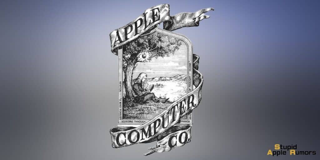
Who designed Apple's first logo? The first logo of Apple Inc., was designed by Ronald Wayne, the third co-founder of the company. He did this in 1976 during the first two years of the company and the logo featured Newton sitting under the apple tree.
Let’s delve into the intriguing story behind Apple's first logo, which featured the iconic image of Sir Isaac Newton under an apple tree.
Also Check Out: 80+ Lesser Known Fun Facts About Apple Inc
Who Designed Apple's First Logo?
In the pivotal year of 1976, the trio of visionaries, Steve Jobs, Steve Wozniak, and Ronald Wayne, embarked on a journey to redefine personal computing with the creation of the Apple I.
To complement their groundbreaking product, they sought a logo that would encapsulate the very essence of their company.
Ronald Wayne, an engineer with a knack for illustration, eagerly took up the task, fueled by a desire to represent knowledge, innovation, and the relentless pursuit of new ideas.
The fruit of his labor was a meticulously crafted pen-and-ink drawing portraying Sir Isaac Newton beneath a flourishing apple tree, elegantly encircled by the company name.
What was the Inspiration Behind Apple’s First Logo?

The deliberate choice of Isaac Newton as the central figure of the logo was no accident.
Newton's indelible legacy as a distinguished scientist and mathematician, celebrated for monumental discoveries such as the law of universal gravitation, made him a remarkably fitting symbol.
While the iconic apple incident might not have transpired exactly as depicted, it had become a universally recognized emblem of Newton's unparalleled brilliance.
Wayne's artful logo sought to embody a kindred spirit of exploration and innovation. The apple tree, reaching skyward with verdant promise, symbolized not just the potential for growth, but also the fertile ground for fresh ideas.
Newton's contemplative pose evoked an air of profound reflection and intellectual curiosity, underscoring the deeper layers of human inquiry.
Why was the First Apple Logo Changed?

Apple's first logo didn't last long. Steve Jobs, known for his design expertise, thought it was too complex.
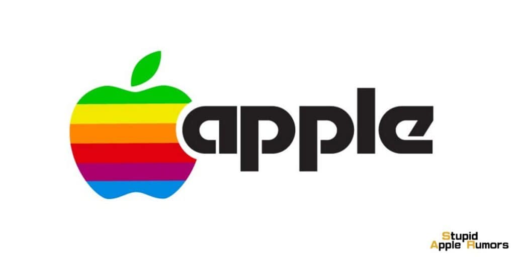
He wanted something that reflected the company's vision of user-friendly computing. In 1977, he hired Rob Janoff, a skilled designer, to revamp the logo.
Janoff's genius creation was a simple, rainbow-colored apple with a bite taken out. This design became an iconic symbol of the brand.
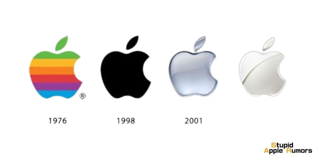
How Did the Apple Logo Evolve Over the Years?

Apple's first logo had a brief existence, but it was crucial to the company's early story. It represented Apple's innovative spirit and commitment to pushing technology's limits.
It also reminded us of the company's humble beginnings and its roots in science and discovery.
The rainbow logo that followed Newton's apple, with its vivid colors, became a globally recognized brand symbol.
Conclusion
Apple's remarkable journey from a garage startup to a technological behemoth is a testament to its unwavering commitment to innovation.
While the logo evolved over the years, the essence of exploration and discovery remains an integral part of Apple's DNA, a legacy that continues to shape its trajectory in the ever-evolving world of technology.
Recommended:


Leave a comment
This site is protected by reCAPTCHA and the Google Privacy Policy and Terms of Service apply.